Cheese Bosco
Branding Design / Emblem Design / Icon Design / Web Design
Cheese Bosco is a cheese-specialty brand that emphasizes communication with its customers. The brand was designed with specific keywords in mind, which included the words organic, professional, and classic.
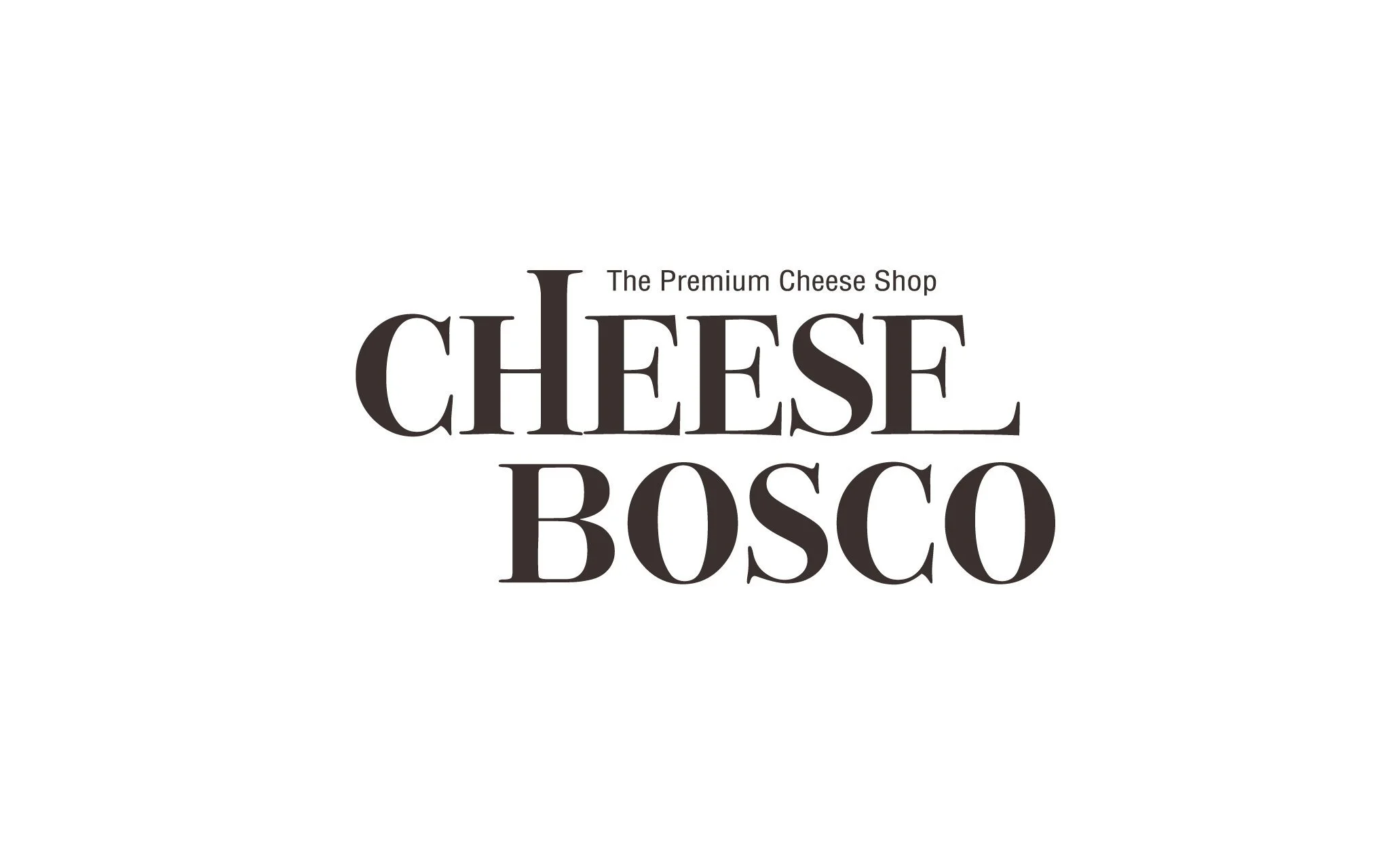
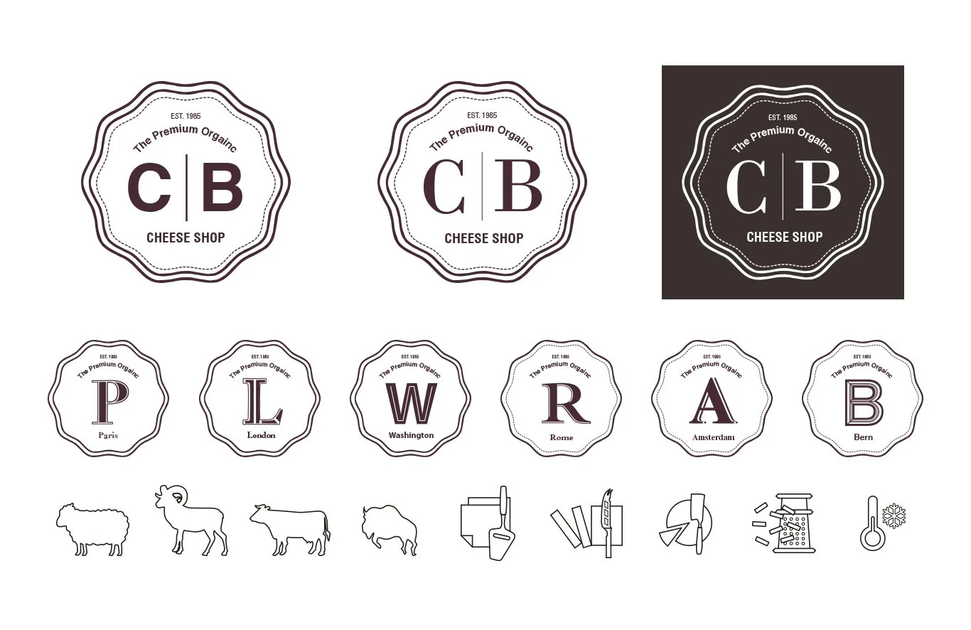
The logo uses a serif font to emanate a classic mood. The logo also uses elongated elements to resemble the melting characteristics of cheese, and allows the customers to intuitively link the logo to a cheese-specialty brand. The emblems pair a distinct font with each city where cheese was produced. The exclusive use of fonts, combined with unique icons, makes it easy for consumers to distinguish different types of cheese.
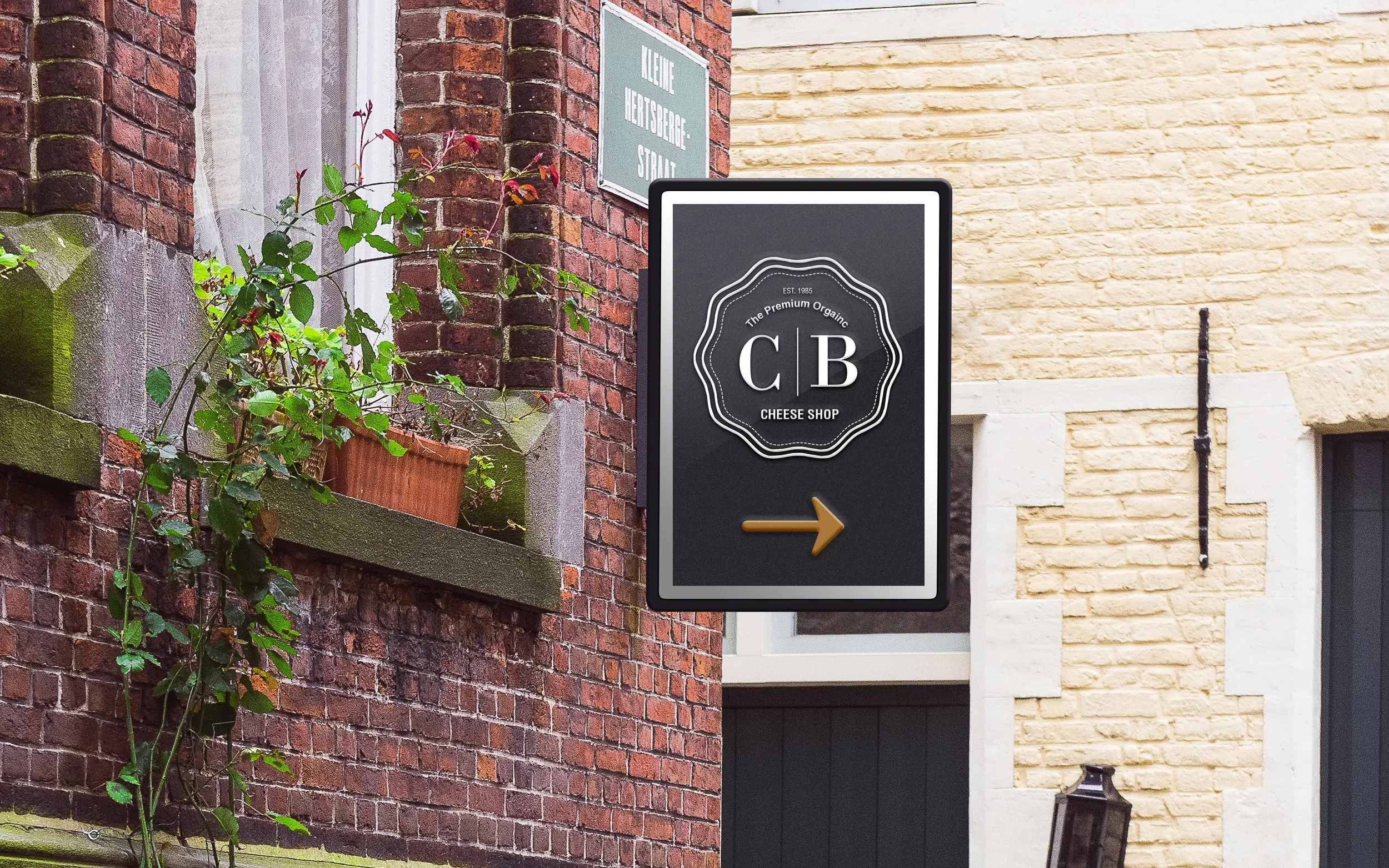
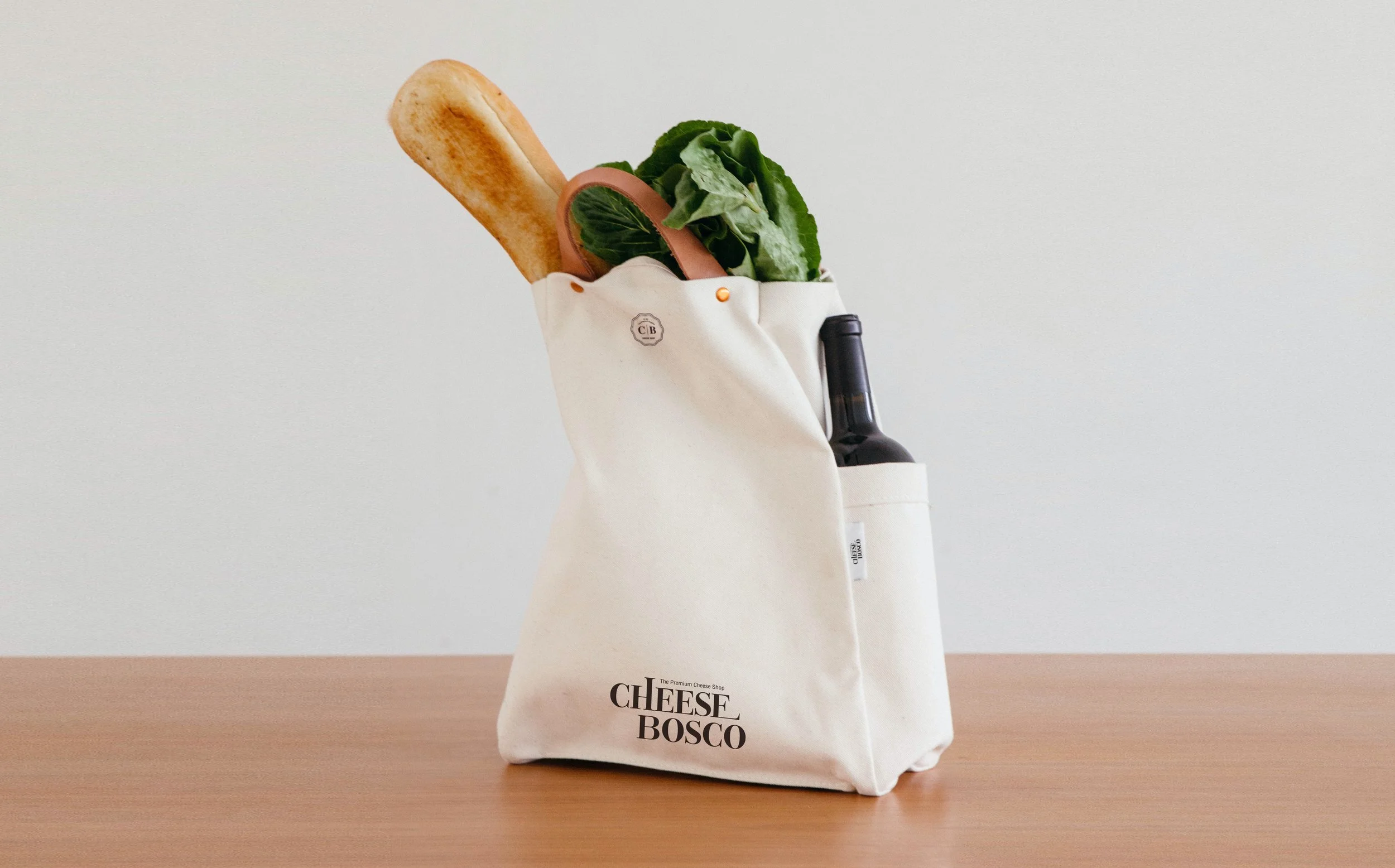
Special attention was given to ensure that the different stages of a customer’s journey, including before, during, and after a visit to a store, had tailored experiences but still shared a consistent theme. The goal was to create a special experience of interacting with the brand.


