Healway Health
Branding Design / Packaging Design
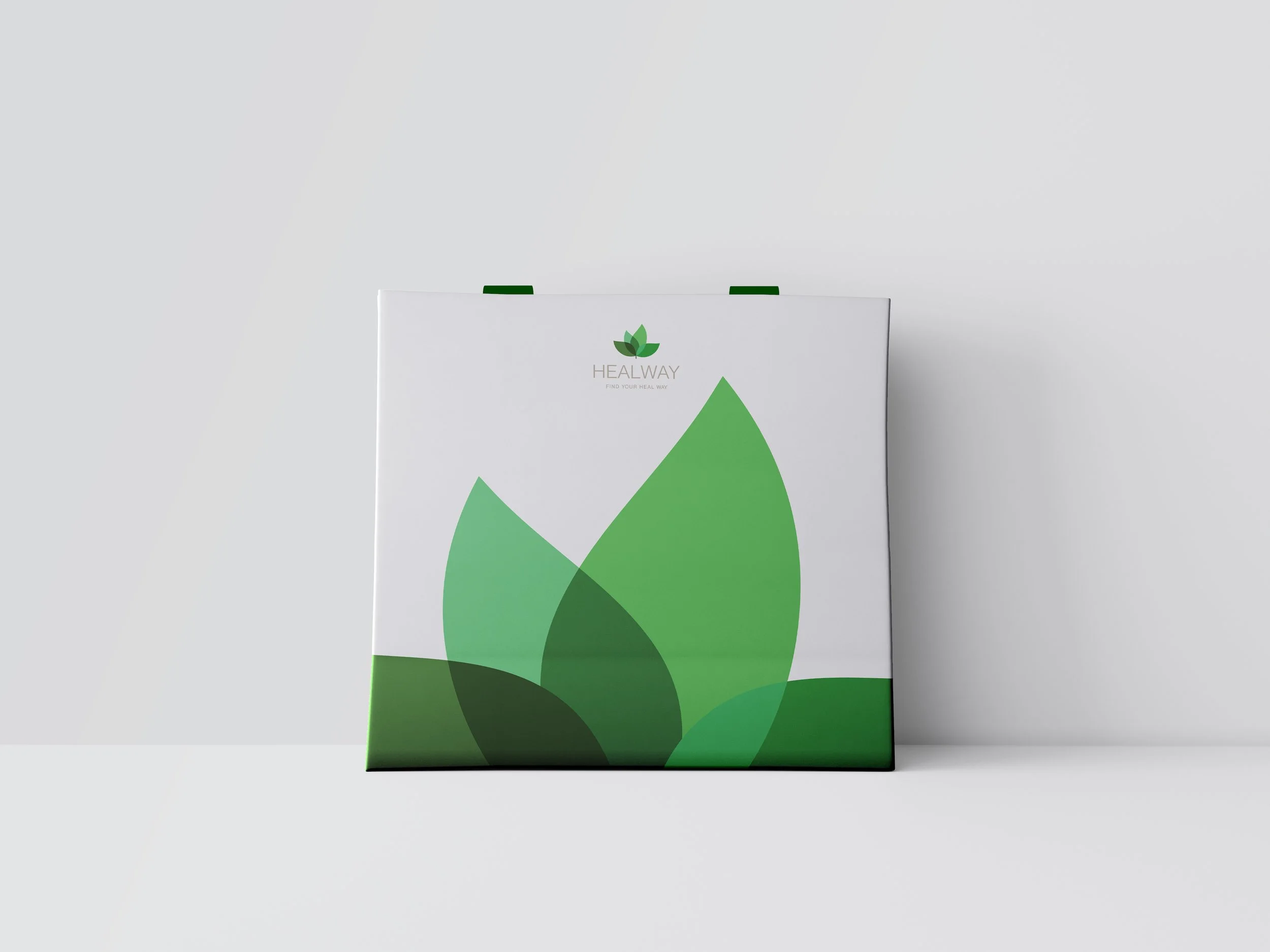
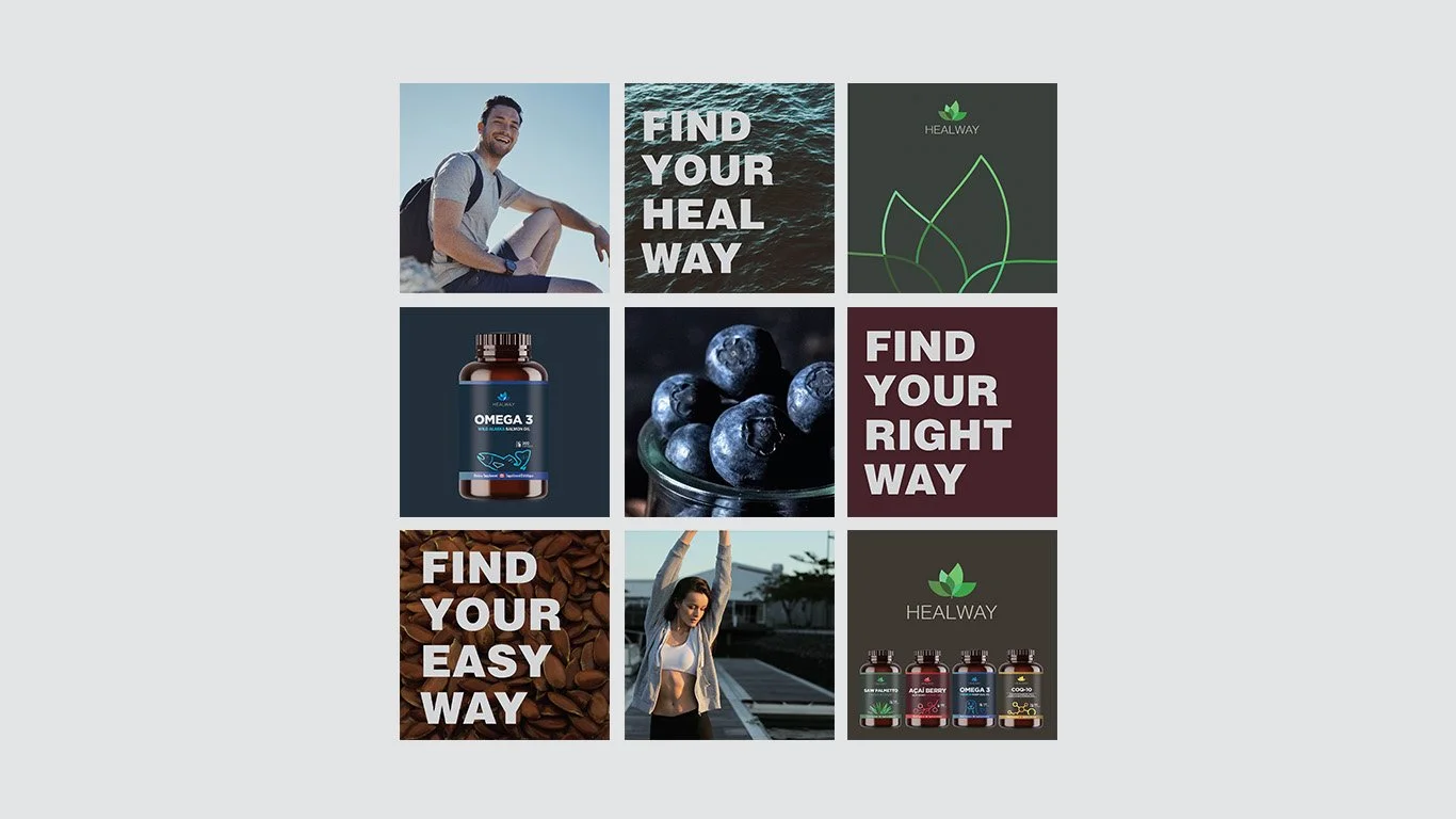
<Healway> is a supplement brand that pursues a healthy life and naturalism. Adhering to this concept, I took inspiration from nature and designed the logo with leaf shapes using variations of diverse tone-on-tone colors. The basic color of the logo is green, but it changes and adapts following different lines, as you would see in nature. I also created the slogan “Find your heal way”, inspired by the brand name <Healway>.
Since <Healway> products were exported to China, the client wanted a packaging design that would be intuitive to understand and recognize even for Chinese consumers who were not fluent in English. The client wanted to feature a picture of the ingredients on the package, but there were already many products with similar designs on the market, so I wanted to create a design that stood out from the others.
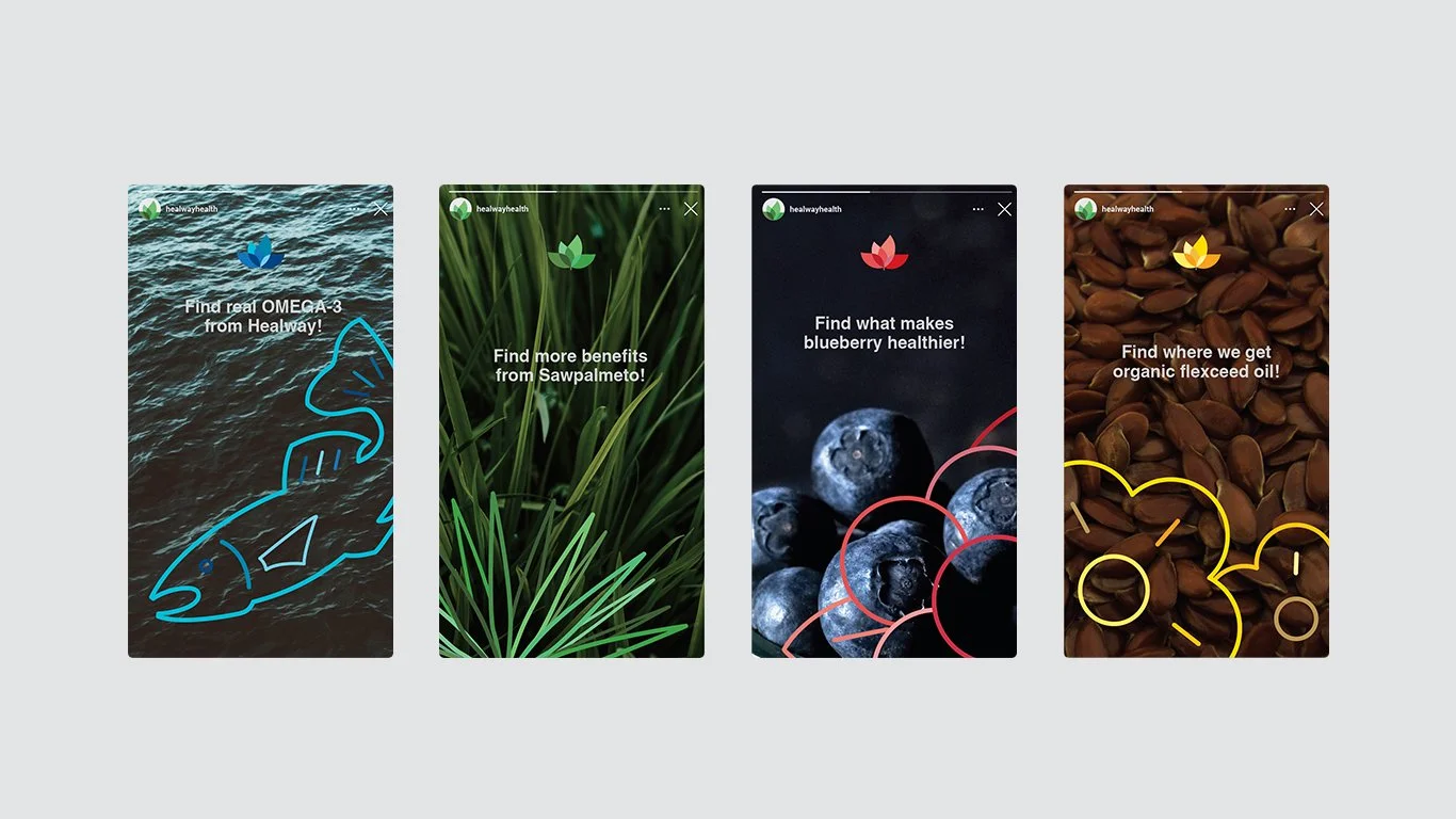
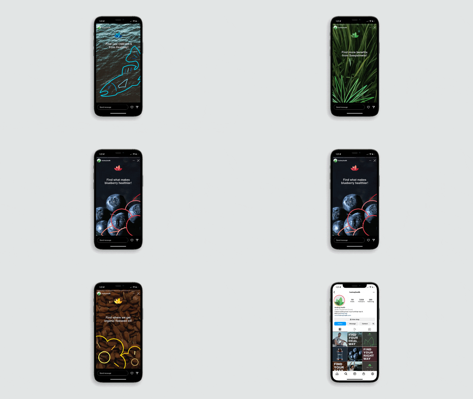
Consequently, instead of pictures, I created custom graphics and used them to produce a clean, uniform design for the labels. These graphics could then be further utilized in expanded scopes to express the brand identity.


