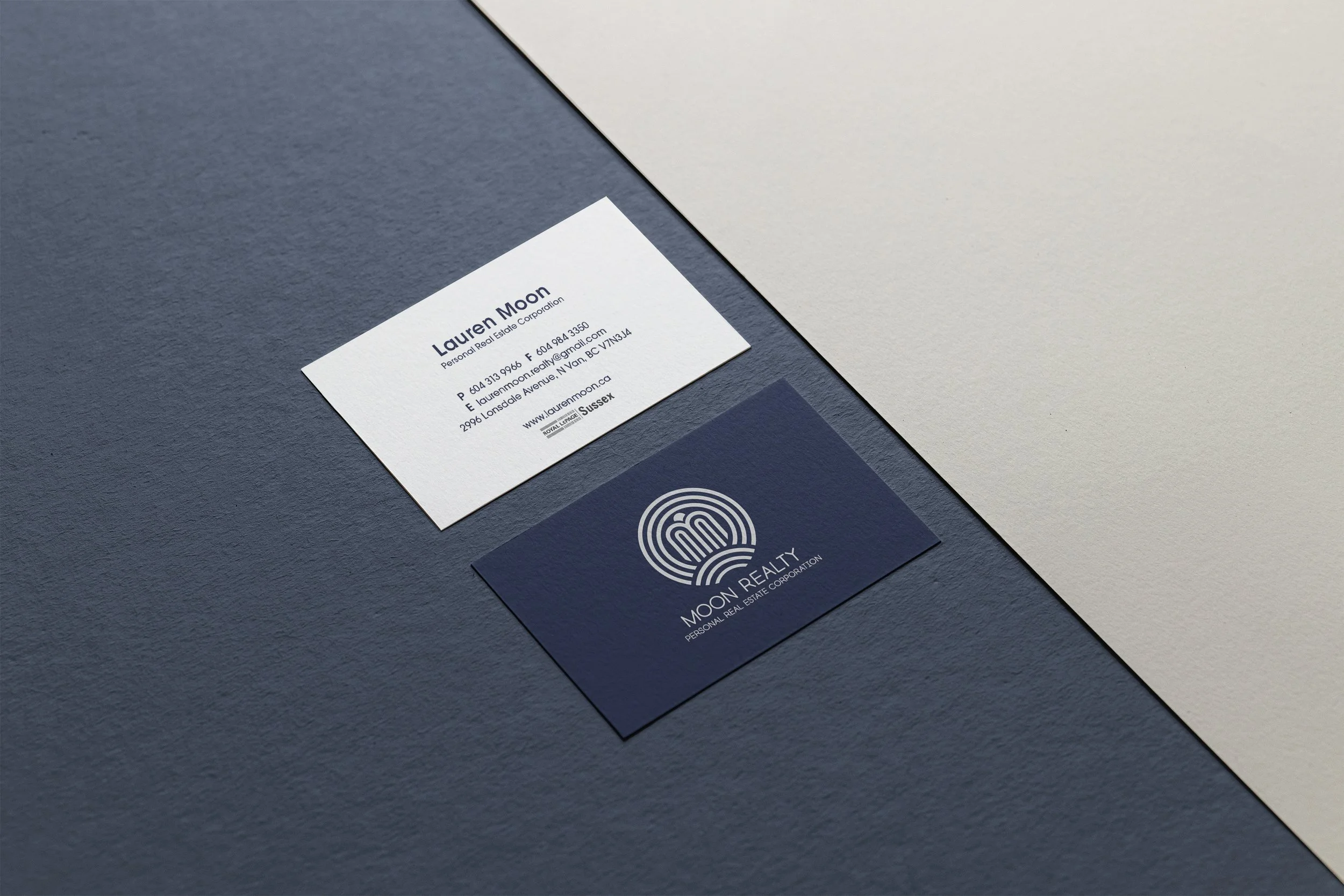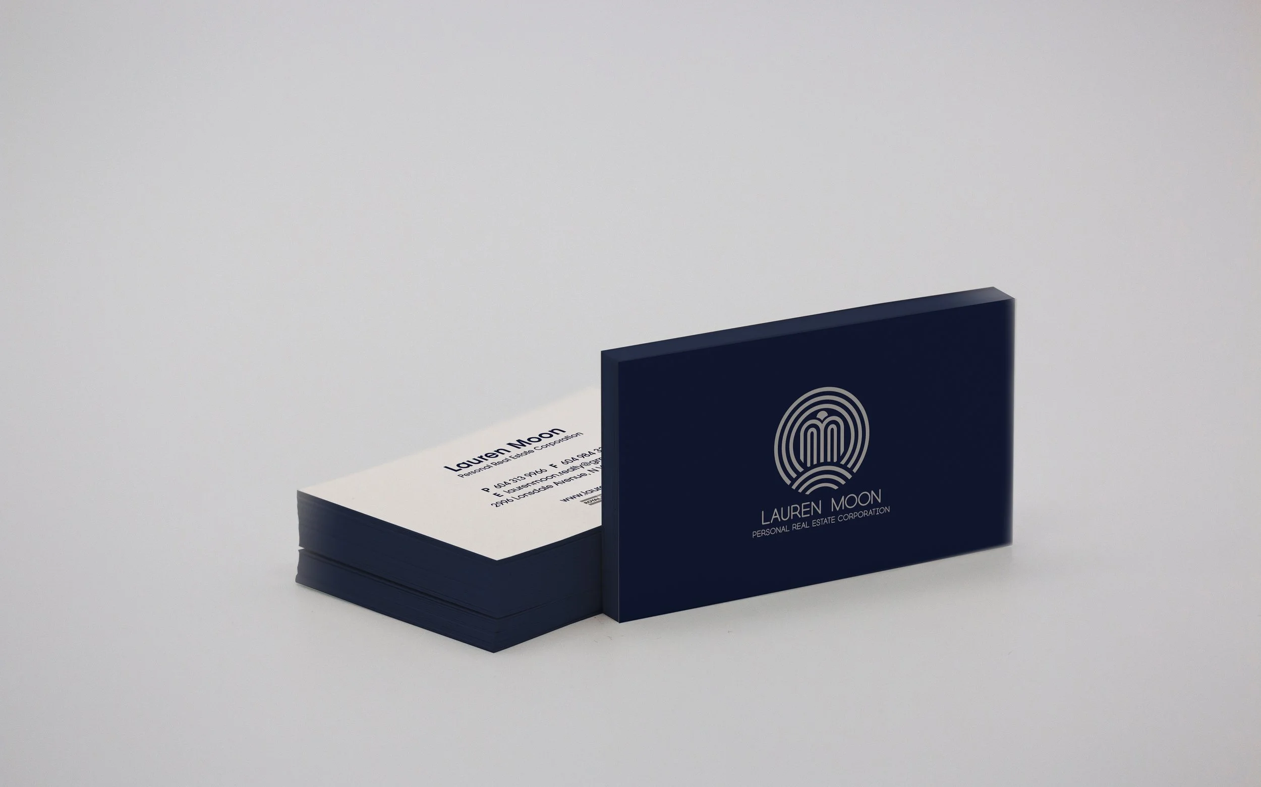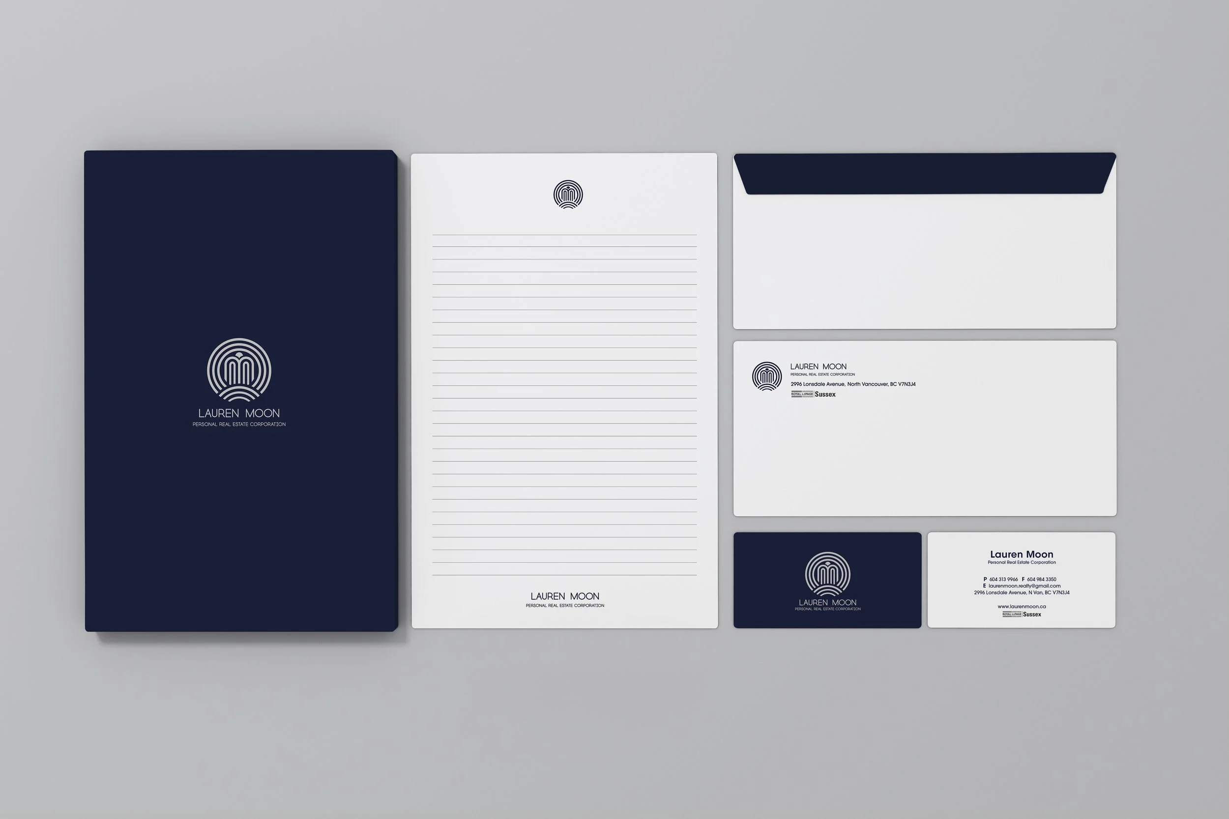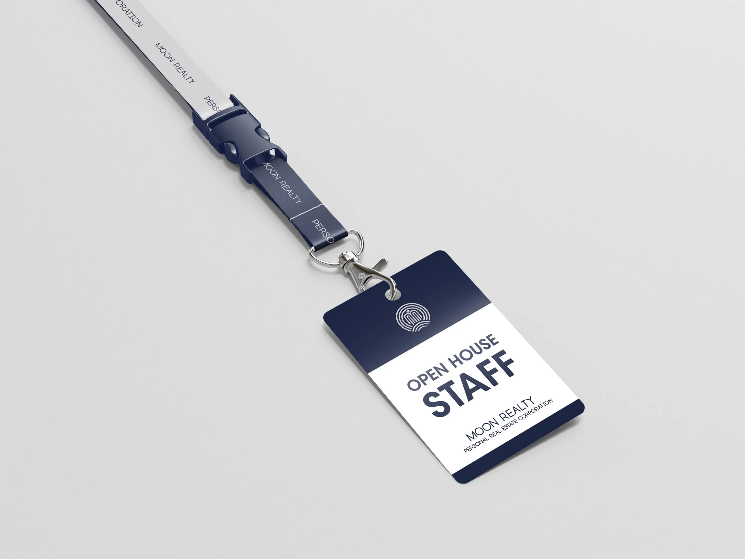
Moon Realty
Branding Design / Logo Design / Stationery Design
Moon Realty is a real estate company that is located in North Vancouver, Canada.
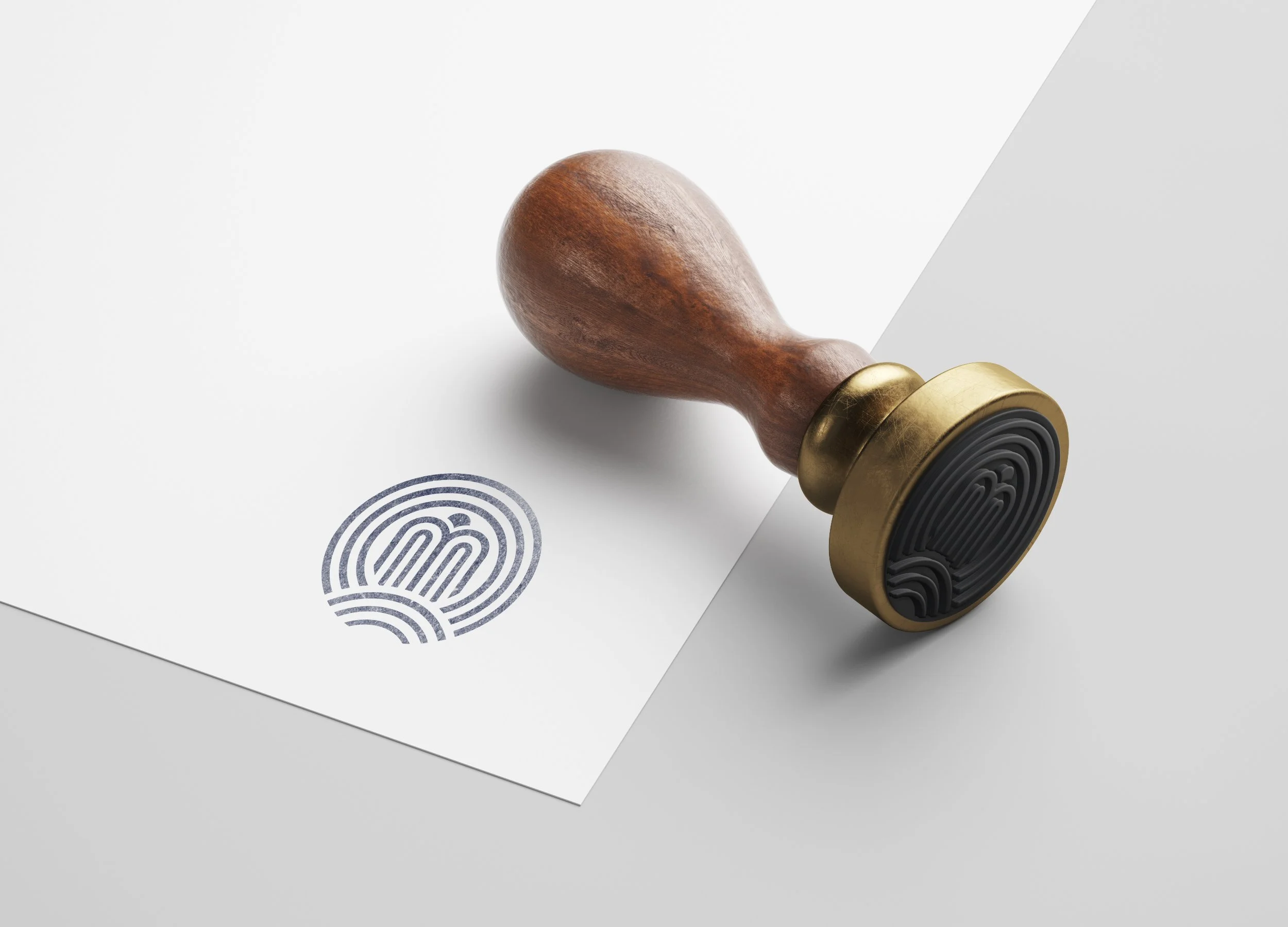
The logo is inspired by the letter “M”, of the client’s last name, “Moon”. The four elements of the logo each represent the village, sea, building, and sun (refer to the below image). These elements represent the geographical features of the city of North Vancouver, where the company is located. In addition, the sun is an essential factor in real estate, and by having the logo contain an image of the sun on top of a building, the logo projects a vision of obtaining the ideal house.


